In today’s digital landscape, your website’s hero banner design is the first thing visitors see.
It’s your chance to make a stellar first impression, knock the ball outta the park, stop the bounce, dazzle from the get-go, start on a high note, absolutely nail it, and convey your brand’s essence in seconds.
Let’s take a look at 8 crucial banner design principles that will help you create an eye-catching, high-converting hero banner design section.
1. Clarity is King in the land of hero banner design.
Your hero banner should instantly communicate what your business does and why it matters.
Avoid abstract or purely decorative images that might confuse visitors by not harmonizing with your brand elements.
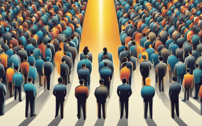
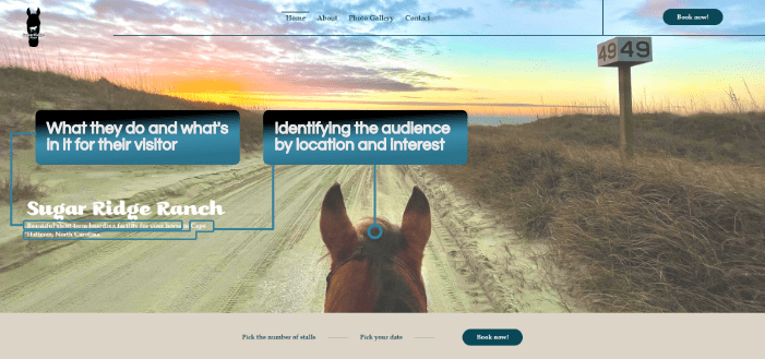
Clearly communicate:
- What you do
- Identify the audience, and
- What’s in it for your website visitor

2. Compelling Imagery
Choose visuals that draw the eye in, evoke an emotion, touch on a desire or problem with your target audience, and align with your offering.
Whether it’s a high-quality photograph, illustration, or video, make sure it’s relevant and engaging.

People are either moving toward pleasure or away from pain.
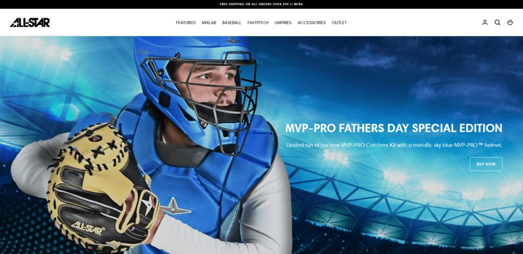
Celebrity Hotels and AllStar use highly aspirational images and therefore offer a pleasurable experience such as luxurious relaxation or doing sport with high performance kit when using their product or service.
3. Concise, Impactful Copy
Your headline should be clear, and direct because clear is always better than clever.
The ideal headline length is between 60 and 100 characters which grabs attention and conveys your main message.
The sub-headline can expand on this, answering why users should choose you and what benefits they can expect.
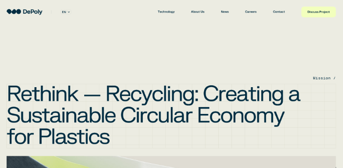
DePoly leaves you with no doubt that they are in the plastic recycling business for a more sustainable economy.
A visitor to their site will quickly know if they are on the right site
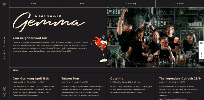
When you land on the website ‘A Bar Called Gemma’ you know immediately what their proposition is, your neighborhood bar, which means if you’re looking for fine dining this is not the place for you tonight unless this is as fine as you’d like your dining to get tonight!
Keep in mind ‘A Bar Called Gemma’ would also need to use well optimized local SEO given the nature of the local area they serve.
4. Strategic Call-to-Action (CTA)
Make your CTA button prominent and use actionable language.
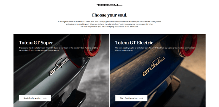
A strong contrast between the font colour and surrounding button element is standard practice but Totem combines contrast with actionable CTA wording that stirs curiosity and goes beyond the usual ‘Learn More’ caption, encouraging the website visitor to dream…

Altage provides 3 ways to take action.
The button providing an opportunity to ‘See Today’s Rates’ is a nice example of a low-risk soft offer CTA.
The website visitor gets the chance to learn more about the company and how it can help them without having to give up their email address to get access to gated information and then worry they’ll be hassled with endless email offers.
5. Responsive Design
According to Statscounter mobile traffic accounts for 62% of traffic flow and desktop 36%, the rest is tablet.
Ensure your hero banner looks great on all devices. Test your design across multiple screen sizes and orientations.
There are many design rules and technical aspects to creating a responsive design.
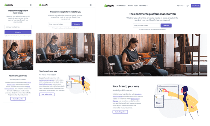
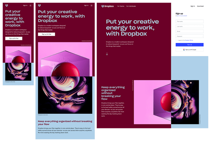
Mobile responsive design is as much about leaving elements out as it is about deciding what you keep, so that your site looks good on a mobile screen.
6. Harmonious Colour Scheme
Choose colours that complement your brand’s palette and create visual harmony.
As you can see with the image carousel from AllStar, the first image combines the neutral white of the kit and typography with a muted blue/gray background. Notice the gray trim of the glove and kit blending with the background.
In images two and three the monochromatic colour palettes, blue in one and brown in the other provide the bulk of the colour palette allowing the product to be the hero of the image.
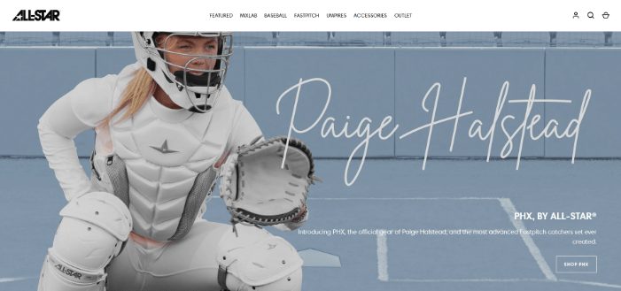

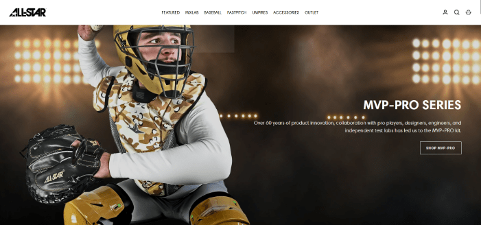
7. Thoughtful Composition
Looking again at the 3 hero banner images in the harmonious colour scheme, the rule of thirds is also clearly visible.

Positioning the model with the kit in the one-third position opens up the space for the headline and sub-head to communicate the value proposition.
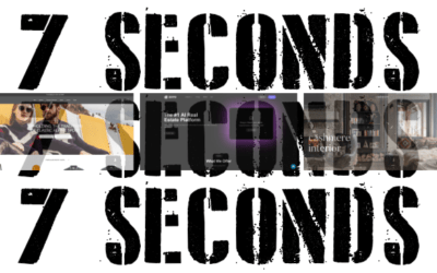
To ensure your hero banner doesn’t slow down your site, it’s important to monitor your page loading speed.
Google’s PageSpeed Insights is an invaluable tool for this, offering a detailed analysis of your site’s performance on desktop and mobile devices.
Research shows that visitor bounce rates increase significantly when load times exceed five seconds, potentially costing you valuable visitor engagement opportunities.
Remember, in the digital world, every second counts!
8. Continuous testing
Your hero banner design is always evolving.
Leverage data-driven decision-making through user research, A/B testing, and buyer persona research.
You could also create multiple versions of your landing page, each featuring a different hero image, and launch them simultaneously. Then, let your audience guide you.
Remember, what looks best to you might not always perform best with your users.
Website analytics offer an unbiased view of user behavior, helping you make better-informed decisions that go beyond gut feelings.