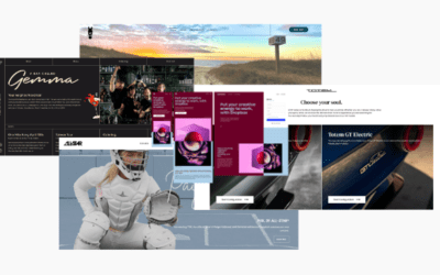
Understanding the 7-Second Website Rule
The 7 second website rule reflects your website’s ability to capture your visitor’s attention and stop the bounce.
Understanding its principles and the impact of first impressions is crucial for engaging your audience effectively.
If you aren’t building goodwill straight out of the gate then you’re on the road to repel those visitors you’ve worked so hard to get to your website.
And your website experiences death by ambiguity.
Principles Behind the Rule
The 7 second rule suggests that you have just a few seconds to grab your visitor’s attention.
People decide to stay or leave based on their first impression of your site.
Attention span has significantly decreased in today’s fast-paced world with an average of only
47 seconds. Users expect instant gratification, which means they want clear information quickly. If your website does not efficiently communicate what you offer, visitors are likely to move on.
Keep in mind that emotions play a big role in this process. A well-designed site can evoke positive feelings, encouraging users to go walkabout.
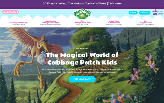
The Cabbage Patch Kids hero image has a high curiosity value with lots of detail.
Your eye needs to spend time taking in the image because of the detail, the entertainment value, and possible easter eggs in the image giving you something to click and a little rabbit hole to go down
Pay attention to your website’s personality, is it sophisticated, minimalist, or quirky…
Because attention spans are short, visitors to your site will skim through it before investing more time so your website’s layout and design should take them on a journey, leading them from one section to another because the job of each website section is to get your visitor to move to the next section, and then the next section and then on to other pages.
Impact of First Impressions
First impressions are critical, as they can determine whether someone trusts your brand. Visitors often assess your website within seconds, deciding if it looks credible and appealing, but more than that does your offer resonate with them.
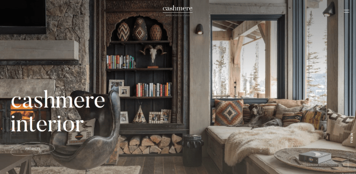
Cashmere Interior creates an interesting information gap. While there is a cashmere blanket on the couch the overall monochromatic colour scheme blends with the blanket and makes you wonder if there is something else they could be implying.
The blanket is the metaphor for the look and feel of the interior spaces they create.
Consider how patience factors in, yep that pesky short attention span. If a site appears cluttered or confusing, users will not take the time to figure it out. Simple, clear designs and a clear offer attract longer visits.
Clear beats clever and specificity beats ambiguity.
Since your website serves as your digital storefront, what do storefronts display?
Storefronts are filled with offers to draw the window shopper inside.
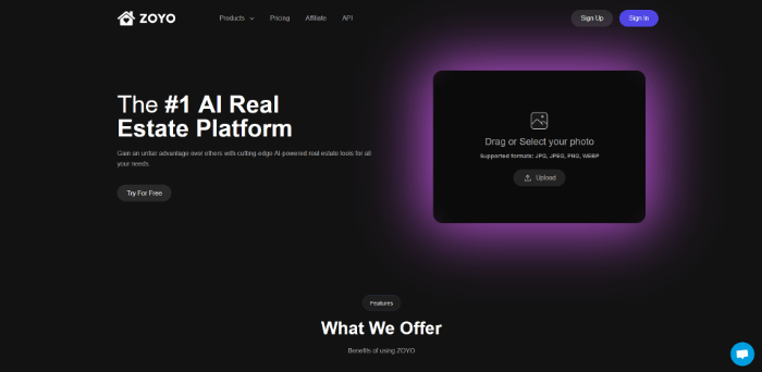
Notice how Zoyo has a heading just above the fold creating curiosity to find out what it is they offer.
The heading does its job by drawing the visitor deeper into the site, and spending more time exploring.
Ensure your website effectively communicates its purpose (offer). Use engaging visuals and copywriting that speaks to your buyer persona to clarify what you offer. This builds a connection with site visitors and keeps them interested.
Design Elements That Make or Break the 7 Second Website Rule
In the fast-paced world of web design, the first few seconds on your site can decide your visitor’s fate and therefore your fate.
Certain design elements play a crucial role in making those seconds count. You need to focus on visual cues, content placement, font choice, and navigation to maximize engagement and keep users interested.
Visual Cue Optimization
To capture attention quickly, your website should use effective visual cues. These can include images, icons, and contrasting colors that guide visitors toward important information. Positioning your logo prominently above the fold reinforces brand recognition.
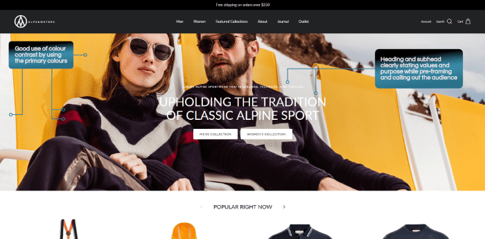
Alps and Meters clearly show through their hero image the style of clothing and apparel they sell. And the heading pre-frames their values of upholding the tradition of classic Alpine sport.
So, if you’re not into classic Alpine sports with a traditional point of view, you can very quickly understand this site isn’t for you.
Keep your visuals relevant to your content. For instance, if you offer a service, use images showcasing your work.
Subtle animations or hover effects can also engage users without overwhelming them. Optimize visual elements to ensure they load quickly, as slow-loading images can frustrate users.
Strategic Content Placement
Placing your most important content strategically is essential for the 7-second test. Aim to present key messages and calls to action (CTAs) within the first few seconds. Use headings and bullet points to make content scannable.
Keep critical information, like offers or product highlights, visible above the fold.
This ensures visitors don’t have to scroll down to find what they need. Use compelling headlines and clear specific language to grab attention right away.
A well-structured layout allows users to quickly understand your site’s purpose.
Don’t be afraid to move your visitors around your site. Time spent on the site is good for business and good for your analytics
Employing Appropriate Fonts
Choosing the right fonts is another crucial aspect of web design.
The 7 second rule doesn’t only apply to your site visitors looking at your site and deciding if they like what they see.
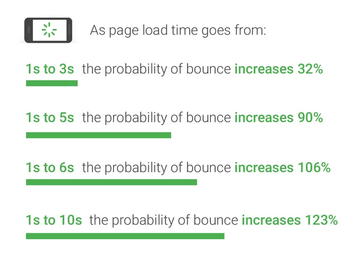
Google’s advice is to get web pages on desktop and mobile to load in under 3 seconds.
If you choose to load custom fonts onto your site this will affect the speed as more information has to be loaded by your browser to then render the site onto your visitors screen.
Using web-optimised fonts such as Google fonts means you’re giving your site just that slight edge to load faster.
Use fonts that are easy to read at a glance. Sans-serif fonts tend to be more legible online compared to serif fonts. Make sure to select font sizes that stand out without overwhelming the layout.
Limit the number of different fonts on your site to maintain a clean aesthetic, a good rule of thumb is no more than 3 different font types.
Stick to a consistent font style that reflects your brand. Use bold or italic styles to emphasize key points, but avoid excessive use that could create clutter.
Intuitive Navigation and Menus
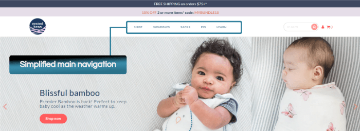
Your website’s navigation system should be simple and intuitive. Clear menus make it easy for users to find what they’re looking for without frustration. Place the main navigation bar at the top of your homepage for easy access.
Use familiar terms for menu items that resonate with your audience.
Consider using drop-down menus for subcategories, but ensure they’re easy to navigate quickly.
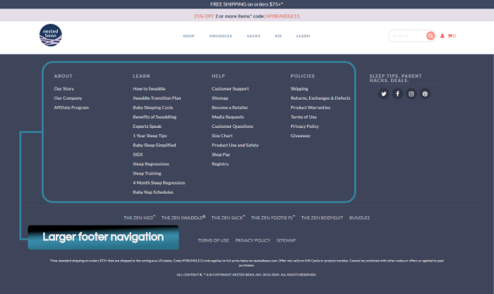
Your website’s top navigation should also focus on selling and product-focused items, while your footer can contain a menu that handles admin and support-related categories.
Don’t create huge mega menus in your top navigation menu as these create additional layers of friction for your potential buyer to find what they’re looking for.
Some of the issues that come with mega menus include:
- Diluting your link equity based on the principles of PageRank which implies that the more links you have on a page the less value it scores
- Duplicate content problems.
- Overdo or duplicate links to the same pages
- Poorly designed dropdown menus create a bad user experience resulting in reduced conversions. Hover functions may not execute properly for touchscreens and the complexity of the mega menu on a mobile responsive screen can be too overwhelming for the user and they may simply bounce.
Mobile responsiveness is also important; your menus should be easy to use on all devices. This attention to design will help keep users engaged beyond their initial first impressions.
Crafting Content for Quick Engagement
To capture your audience’s attention, you need entertaining and relevant content that creates a compelling first impression.
Focusing on engaging headlines and writing effectively for web readers will help you communicate your messaging and ensure you remain relevant.
Creating Engaging Headlines
Your headlines are the first thing visitors see, so make them count.
A headline makes a promise, it tells the reader what to expect straight out of the gate.
Make sure whatever the content follows the headline, it delivers on the promise.
Use short, impactful words that convey valuable information.
Aim to answer questions or spark curiosity.
Consider using numbers or actionable language. For example, “5 Tips for Better Marketing” is more engaging than just “Marketing Tips.” Avoid jargon and keep your headlines simple. They should be easy to understand at a glance.
Writing for the Web Audience
Web audiences often skim content, so your writing should cater to this behavior.
Break up text into short paragraphs and use bullet points or lists for clarity. This helps readers find relevant content quickly.
Keep your sentences concise and to the point.
Use simple language to make your messaging clear. Focus on essential information that meets the needs of your audience. The average American reads at the 7th- to 8th-grade level.
By doing this, you enhance engagement and encourage visitors to explore your site further. Remember, effective text keeps your audience interested and informed.
Leveraging Additional Channels
Using various channels effectively by distributing your content can greatly enhance your website engagement.
Incorporating Social Media Elements?
Are social media share buttons worth the hassle?
My observation is that the most used share buttons are the bookmark and “read later” functions as well as sharing directly with a friend.
When was the last time you actively felt moved enough to share a website or article on your social media profile?
Most people are more inclined to save something so that they can come back to it later.
It’s usually the high-volume consumer news and publishing sites, think BBC, Nike, Financial Times, etc. that will get articles and promotions shared.
There is some value to be gained by embedding some of your own and sharing other people’s social media content on your website as you get some SEO juice out of the backlinks and external links.
However, do this strategically to share relevant information that adds value to people visiting your site as well as adding the entertainment factor.
Personalization through Chat and Support
Personalization is critical in today’s market. Implementing chat features on your website can provide instant help. Visitors appreciate quick responses to their questions, which aligns with the 7-second rule.
Connecting with users through social media and personalized support options such as onsite chatbots and chat widgets encourages interaction, but make sure that your business can serve visitors properly via these chat widgets.
If no one is there to handle the chat or your chatbot isn’t properly trained it leads to a bad experience and people will bounce. Get it right though and it makes it easier to keep their attention in line with the 7-second rule of websites
Effective chat strategies include:
- Offering chatbots for basic inquiries.
- Providing options to connect with a live agent if needed.
Additionally, email follow-ups can be valuable. Send personalized messages based on user behavior on your site. This approach makes people feel heard and boosts your chances of repeated visits.
Nothing puts people off a business quite like sending messages and emails that disappear down the black hole of the internet.
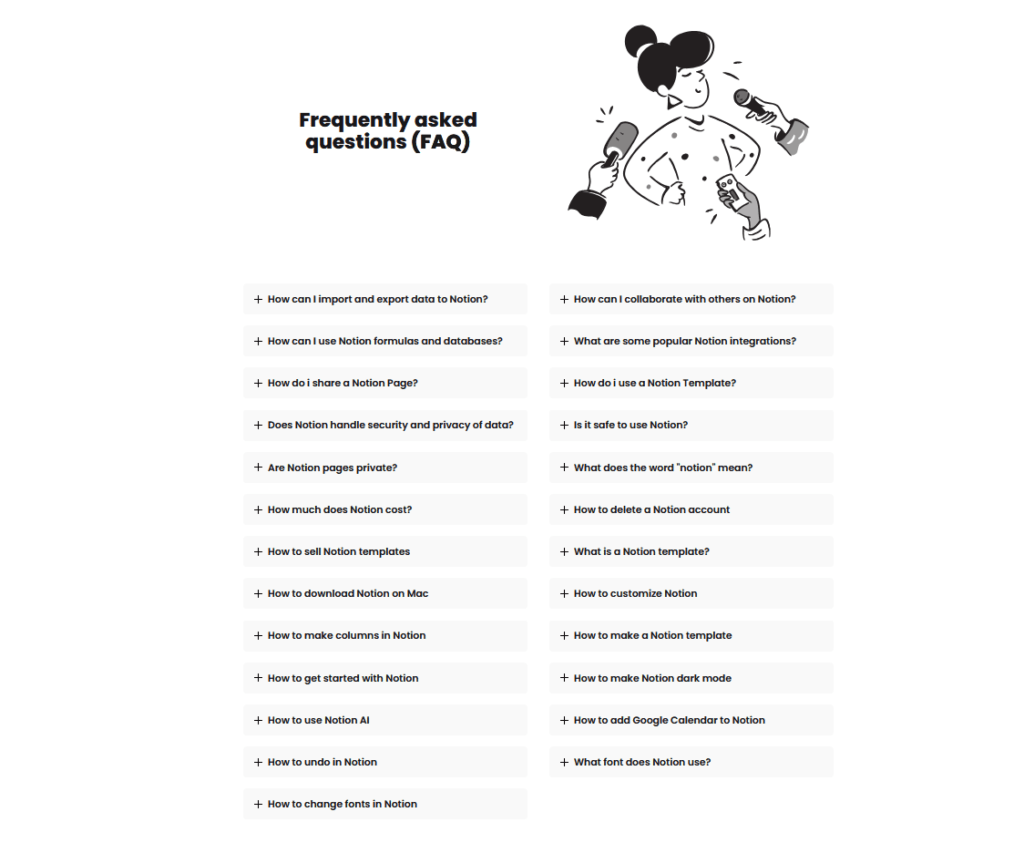
FAQ’s
Visitors to your website are typically looking for information. Which means they want answers to questions. If you have a series of questions that have the same answer over and over again then an FAQ section is the way to go.
The benefits of an FAQ section are:
- You automate the question-and-answer process: if you need to answer the same question over and over again then automate the answer.
- Improved User Experience: An FAQ section helps users quickly find answers to common recurring questions, giving them an overall better experience on your site
- Increased Trust and Credibility: By addressing common concerns and questions, you establish trust with your visitors as they see that you are willing to answer their concerns.
- Enhanced SEO: FAQ sections can improve your website’s search engine optimization by incorporating relevant keywords and phrases.
- Reduction in Customer Support Queries: By providing clear answers to frequently asked questions upfront, you can reduce the volume of inquiries directed to you or your customer support team.
Your first seven seconds matter so make them count. Ensure you’re doing all you can to keep your website visitors around long enough for them to get to know you better.